Data is the key to science. This statement provides the basis for making observations, developing hypotheses, doing experiments, analyzing results, and revising hypotheses. Without data, “science” would be limited to theories that, however well-thought out, may or may not be true.
As obvious as that might be to all of us as science teachers, we often stray from data collection. We tend to do labs which are demonstrations of a concept or collect data to prove a point, but we rarely do lab activities which require students to collect AND analyze data.
I am completely guilty of this, too. “Guilty” might not be the right word since there are completely valid reasons for doing demonstration-style labs. Students need a way to visualize what you are teaching and these demonstrations provide that, enhancing understanding. That noted: They do not really allow students to experience science.
What does it mean to “experience science?” Needless to say, simply collecting data is not enough. The data should be analyzed – does the data support or reject the hypothesis? Further, does the data mean that we should revise our hypothesis? It’s not about being “right” or “wrong,” but rather about developing a better understanding of the world around us – a world which in most cases for Biotechnology classes, is far too small for us to actually see.
We need to engage our students in data collection, but my focus is on data analysis. In most labs which have students collecting data, we have them compare different trials by “looking at the average.” For example, I have my Biology students measure their “recovery time” after exercise. We collect recovery times from students who perform jumping jacks and others who run in place. We then get an average recovery time for both types of exercises and check to see if our hypothesis is supported. If it is, we propose what next year’s class could do to further test this idea. If it isn’t supported, we try to revise our hypothesis and still propose what next year’s class could do to test our revised hypothesis.
In the Biotechnology class, however, I want my students to go further in their analysis. Averages can be misleading. One or two data points can lead to averages which are different but not “statistically meaningful.” In the case of the different exercises, one data point which is 10 minutes longer than the others can have a big impact.
In order to further analyze their averages, my Biotechnology students use Google Sheets (or other graphing programs) to calculate and plot error bars based on “standard deviation.” These error bars allow us to see the uncertainty of the data. SEE BELOW. For example, if the error bars from one experiment to another overlap, then there is NO statistically significance between the averages and we have to conclude that they are essentially the same. If the error bars DO NOT overlap, then there is statistically significance between the averages and our hypothesis is supported.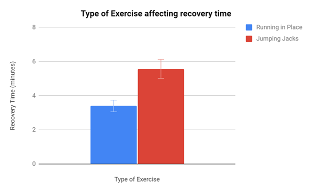
My point with them is not to train them on how to calculate “standard deviation” – the computer program will do that for us – or even to know if “standard deviation” is the proper statistical analysis which we should be doing. Rather, my point is to show that we should be doing more than just collecting data, we need to analyze it . . . and averages . . . can be misleading.
Even error bars do not necessarily make the data clearer. In September, the CDC’s Advisory Committee on Immunization Practices (ACIP) met to discuss recommending boosters for the Pfizer vaccine. One of the bits of data they analyzed is below:
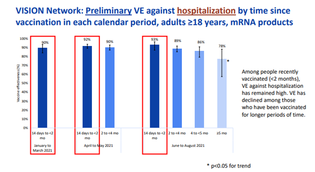
This data looked at whether the vaccine was still effective as time passed after the second dose. The data for ≥5 months has error bars which overlap the data for other durations of time. In other words, there was not a clear indication that the booster was needed based on that statistical analysis. The data does show that a different statistical analysis showed that the data did trend downwards, but it still did not meet the “error bar test.” If you recall, the committee made the recommendation that only older individuals receive the booster. The CDC Director, Dr. Rochelle Walensky, then reversed that recommendation to include people in “high risk occupations.” Sometimes, scientists have to use more than just statistical analysis, especially in the middle of a public health crisis.
Our next Virtual Teacher Meet (scheduled for December 7th from 7:00 – 8:00pm) will focus on data analysis. I provide data for us to work with and model how to use Google Sheets to develop error bars on graphs. Please feel free to bring some of your own data to look at as well. This work will help your students understand that it’s important to look at the data in more than just one way. Hope to see you then!